F&P:
Overview
Project Need
Driven by Fundraising & Philanthropy (F&P)’s desire to remain an invaluable resource for leaders and progressive thinkers the nonprofit sector, our challenge was to significantly improve the user experience of the Fundraising & Philanthropy website and digital magazine for its loyal readers. The organisation had gone through a recent rebrand and needed their website to reflect these updates.
More importantly, the Fundraising & Philanthropy website was more than 5 years old.
It had a range of areas that required improvements including the optimisation of content for mobile and tablet devices for an increasingly mobile ready audience/reader base. Making it easier for people to subscribe to the magazine and for advertisers to promote their messages were additional key considerations of the new Fundraising & Philanthropy website redesign/build.
Technology
WordPress
Client
Fundraising & Philanthropy
What We Did
UI/UX Design, Responsive Web Design, WordPress Development
Creating a digital magazine
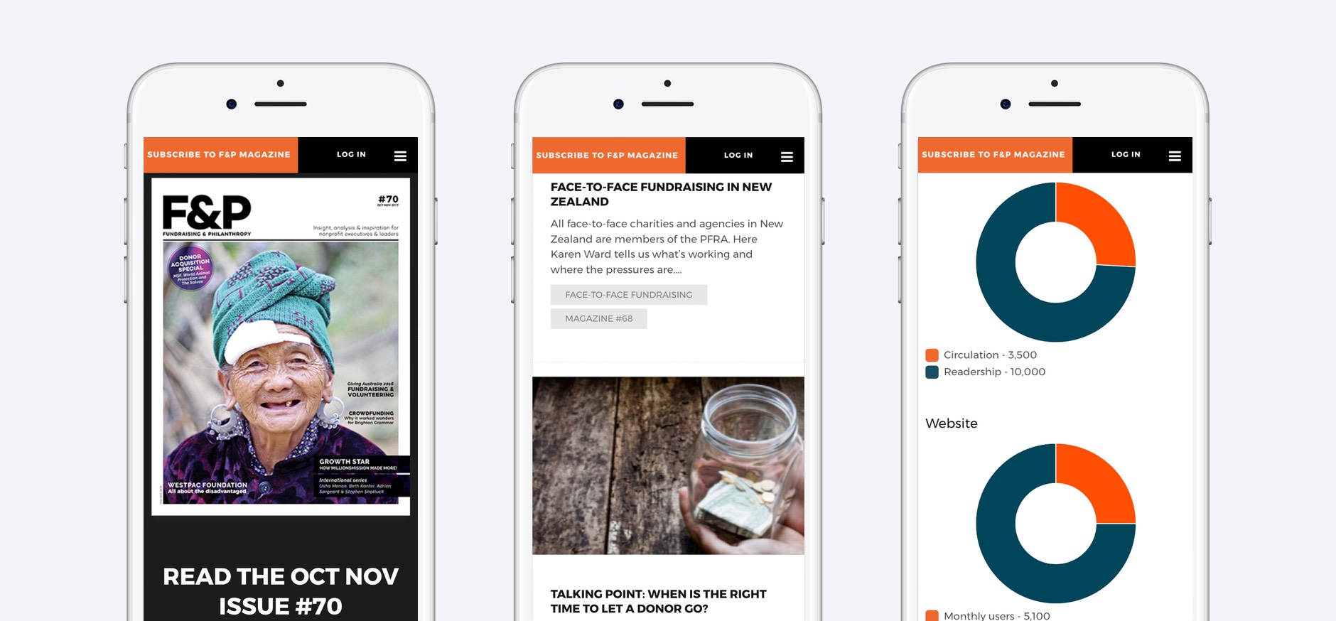
Critical to the Fundraising & Philanthropy website redesign was making their magazine content optimised and readable online for their subscribers. Before our work with them, their digital magazine consisted of a downloadable/readable PDF version of their print magazine – a non optimised experience for subscribers to the magazine, particularly on mobile devices. We designed a digital magazine format which allowed Fundraising & Philanthropy to use their new WordPress website to create optimised web pages for their digital magazine article content – with secured access based on subscriber login credentials. The end result was an optimised magazine content experience for Fundraising & Philanthropy subscribers.
Making access to content, easy
As part of the website redesign and development, we worked with the Fundraising & Philanthropy team to re-think how content was accessed on the new website. The previous website made it difficult for readers to engage with content. Much of the content was protected for subscribers only and was hidden from a large portion of the audience visiting the Fundraising & Philanthropy website, leaving readers increasingly frustrated. This was compounded by a lengthy subscriber sign up process, the combined effect of which was an unnecessarily high bounce rate across the site. We took F&P Magazine back to the drawing board to explore a new and improved strategy of restructuring their sitemap/website navigation and instilling a delicate balance of premium vs free content across the new site to keep both readers and advertisers engaged.
Advertising
Advertising is a key component of Fundraising and Philanthropy’s business. We thought through the best ways of having advertising exposure built into the new website experience. More ad space was achieved throughout the new website to entice advertisers and event sponsors. Simultaneously, we were able to diversify the layout and form of these ad spaces without intruding on the Fundraising and Philanthropy reader experience.
Streamlining the path to action
We focussed on restructuring the navigation menu and eliminated confusing navigational elements that were causing friction for users navigating the website. Our process involved rigorous user testing to ensure that we devised the best user experience and subscription path for Fundraising and Philanthropy’s readers, whether they visit the website on mobile, tablet or desktop. We developed a call-to-action strategy to complement the user-friendly navigation, providing a clear and frictionless pathway designed to turn non-members into subscribers to the magazine and to drive ticket sales of F&P events.