Do you find it difficult to report on your various website and social media metrics? Or feeling the time crunch and need to automate the process?
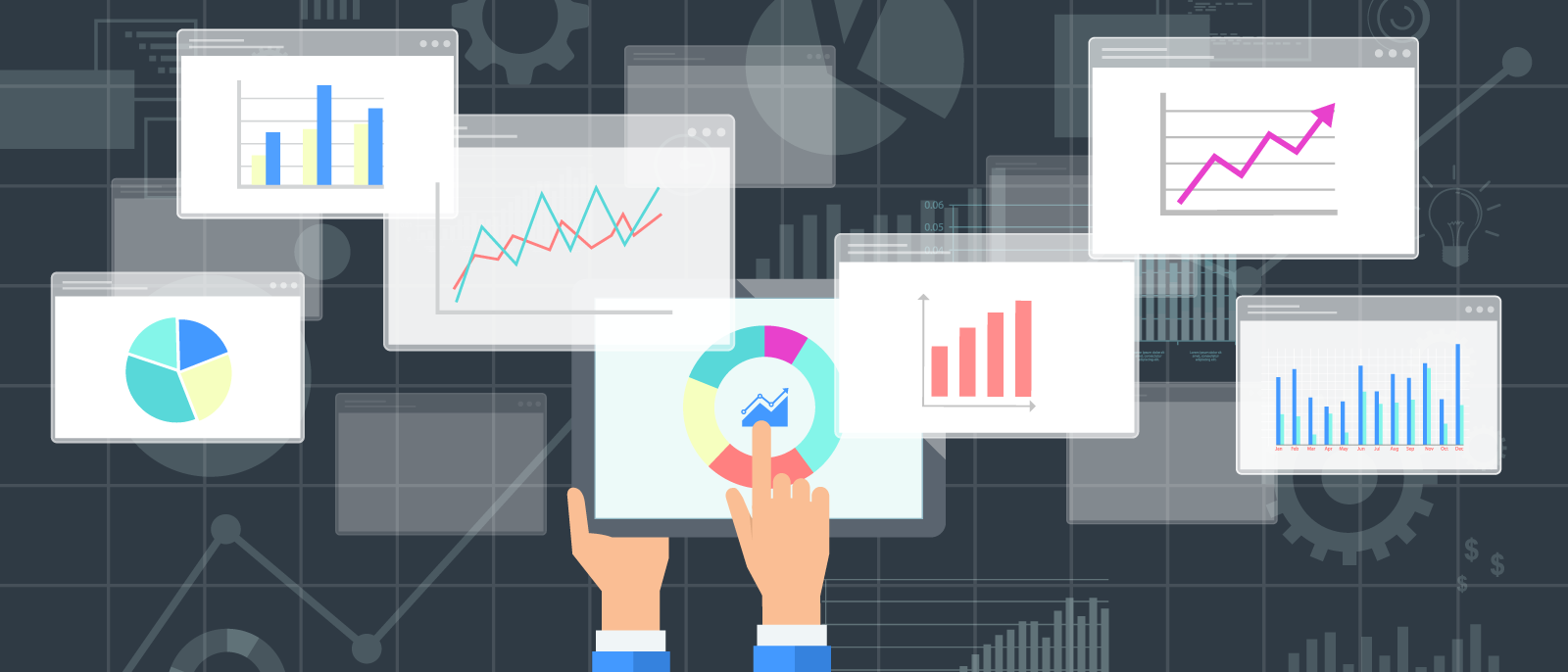
Dashboards are an amazing way to consolidate key information, track performance metrics and answer strategic questions with the data from various tools. They work by compiling data from a variety of sources into one place, allowing you to see information from your Google Analytics account, Google Ads (previously Google AdWords, before July, 2018), Facebook, email platforms, and many other sources you may be using. Why does this matter? Because having so many streams of information in separate places is not only cumbersome and pretty annoying, but it can cause you to lose sight of the big picture and impair your ability to manage oversight of your key performance indicators (KPIs).
Marketers, Fundraisers and Service/Programme managers will find a dashboard useful because, not only will it save time and provide real time metrics, but it will help answer key questions and allow them to better evaluate the success of their online platforms and communication platforms.
1. Pull data from multiple data sources
Dashboards are an effective tool because they draw information from multiple sources. Presently, most nonprofits require key information from multiple channels, not just one. For any given organisation they will most likely utilise multiple elements of Google Analytics (including goals, segments and traffic sources), but also various communications platforms, Google Ads, Facebook Ads and Insights, Google Search Console, YouTube Analytics, and many, many more tools. Each data source presents incredibly valuable information, and together, these sources of data help convey the true reach of an appeal, the effectiveness of a campaign, or the impact an investment in advertising may have achieved.
Rather than logging into each data source, dashboards allow this information to converge into one, clear platform giving coordinators, managers and executives quick and clear insights into the performance of their communication platforms and campaigns. Ensuring dashboards stay up-to-date is essential, because application programming interfaces (APIs) change regularly, so your dashboard’s connectors must be continually updated to ensure information is readily accessible.
2. Real-time and filtering
Dashboards not only allow organisations to view data from multiple sources, but they also allow end users to interact with data in real-time. For example, a user can ask key questions and see the answers based on live streams of data. Not only will the user get the answers, but they can also use tables and graphs to manipulate the data they want to see. Dashboards include interactive features, like filters, which allow users to toggle between different sets of information. This feature allows a user to look at a specific date range, or focus on specific sources (e.g. Facebook, Search, etc.), or even compare data across time periods or tools. Having real-time access to such information can allow you to change course immediately, rather than waiting for reports to be developed hours or days later, resulting in greater impact and reach.
3. Team collaboration
Similar to sharing documents, dashboards can be shared across teams, allowing members to view, edit and add comments. Users can also grant access and set permissions, giving them control of dashboards.
Having the ability to collaborate means that dashboards can be effective across teams and for navigating information sharing, and idea building. This means not only can this information be used to develop ideas and foster planning, but feedback can also be easily collated and presented for reporting purposes, such as monthly/quarterly summaries or board reports.
4. Data visualisation
The ability to visualise results is incredibly powerful for understanding and interpreting the effectiveness of communication platforms and campaigns. Dashboards include visualisation and customisation features that allow users to not only engage with the raw data in a different way but also compile information to develop persuasive and engaging data stories. In a time poor environment, having dashboards do all of the heavy lifting in interpreting your data can be a huge time saver.
5. Customisable
Not only are dashboards configured based upon the data sources which are included, but they are also fully customisable based on the organisation’s goals and objectives. For example, there are standard metrics like, “Revenue by top channel”, or “Revenue by demographics/age group/gender” etc.
Dashboards are meant to help individuals and organisations draw together data from various sources to help understand their impact, answer key questions, and truly have oversight of online metrics and KPIs. Put simply, dashboards allow organisations to have quick, real-time access to essential information in one glance.
Wrapping Up
Every nonprofit has key data it needs in order to understand the effectiveness of its strategy and impact. Figuring out what you need to capture (drawn from your organisation’s strategic goals, objectives and KPIs), and ensuring your data points are set up properly, e.g. having the correct goals tracked in Google Analytics, and your connections to each platform work are pivotal for having a dashboard that monitors and tracks your metrics.
No matter if you are at the beginning of your tracking and dashboard journey and have no idea where to start or you are well on your way to being a dashboard guru and just need a bit of a helping hand, we are happy to help. Just fill in the form below and we’ll chat.
